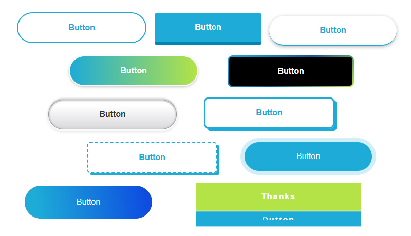
今回はコピペで作れるCSSボタンデザインをご紹介していきます。
私が現場において使用頻度の高いものを中心に掲載しています。
後半では遊び心のあるボタンデザインも掲載していますので、シーンに合わせて使い分けて頂ければと思います。
ホバーアクション(マウスを重ねた時の変化)も合わせて入れてますので、すぐにご使用頂けます。
※テーマや既存のCSSによっては見え方が多少異なる場合がありますのでその都度調整をお願いします。
[nop]
シンプルなボタンデザイン
Button
CSS
a.btn_01 {
	display: block;
	text-align: center;
	vertical-align: middle;
	text-decoration: none;
	width: 120px;
	margin: auto;
	padding: 1rem 4rem;
	font-weight: bold;
	border: 2px solid #27acd9;
	color: #27acd9;
	transition: 0.5s;
}
a.btn_01:hover {
	color: #fff;
	background: #27acd9;
}
Button
CSS
a.btn_02 {
	display: block;
	text-align: center;
	vertical-align: middle;
	text-decoration: none;
	width: 120px;
	margin: auto;
	padding: 1rem 4rem;
	font-weight: bold;
	border: 2px solid #27acd9;
	background: #27acd9;
	color: #fff;
	transition: 0.5s;
}
a.btn_02:hover {
	color: #27acd9;
	background: #fff;
}
Button
CSS
a.btn_03 {
	display: block;
	text-align: center;
	vertical-align: middle;
	text-decoration: none;
	width: 120px;
	margin: auto;
	padding: 1rem 4rem;
	font-weight: bold;
	border: 2px solid #27acd9;
	color: #27acd9;
	border-radius: 100vh;
	transition: 0.5s;
}
a.btn_03:hover {
	color: #fff;
	background: #27acd9;
}
Button
CSS
a.btn_04 {
	display: block;
	text-align: center;
	vertical-align: middle;
	text-decoration: none;
	width: 120px;
	margin: auto;
	padding: 1rem 4rem;
	font-weight: bold;
	border: 2px solid #27acd9;
	background: #27acd9;
	color: #fff;
	border-radius: 100vh;
	transition: 0.5s;
}
a.btn_04:hover {
	color: #27acd9;
	background: #fff;
}
立体的なボタンデザイン
Button
CSS
a.btn_05 {
	display: block;
	text-align: center;
	vertical-align: middle;
	text-decoration: none;
	width: 120px;
	margin: auto;
	padding: 1rem 4rem;
	font-weight: bold;
	border-radius: 0.3rem;
	border-bottom: 7px solid #0686b2;
	background: #27acd9;
	color: #fff;
}
a.btn_05:hover {
	margin-top: 6px;
	border-bottom: 1px solid #0686b2;
	color: #fff;
}
Button
CSS
a.btn_06 {
	display: block;
	text-align: center;
	vertical-align: middle;
	text-decoration: none;
	width: 120px;
	margin: auto;
	padding: 1rem 4rem;
	font-weight: bold;
	border-radius: 100vh;
	border-bottom: 7px solid #0686b2;
	background: #27acd9;
	color: #fff;
}
a.btn_06:hover {
	margin-top: 6px;
	border-bottom: 1px solid #0686b2;
	color: #fff;
}
Button
CSS
a.btn_07 {
	display: block;
	text-align: center;
	vertical-align: middle;
	text-decoration: none;
	width: 120px;
	margin: auto;
	padding: 1rem 4rem;
	font-weight: bold;
	color: #27acd9;
	border-bottom: 2px solid #27acd9;
	border-radius: 100vh;
	box-shadow: 0 2px 7px rgba(0, 0, 0, .3);
	-webkit-box-shadow: 0 2px 7px rgba(0, 0, 0, .3);
	transition: 0.5s;
}
a.btn_07:hover {
	color: #fff;
	background: #27acd9;
	border-bottom: 2px solid #fff;
	transform: translateY(3px);
}
Button
CSS
a.btn_08 {
	display: block;
	text-align: center;
	vertical-align: middle;
	text-decoration: none;
	width: 120px;
	margin: auto;
	padding: 1rem 4rem;
	font-weight: bold;
	background: #27acd9;
	border: 6px outset #1699c5;
	color: #fff;
	transition: 0.5s;
}
a.btn_08:hover {
	background: #44c6f2;
	border: 6px outset #27acd9;
	color: #fff;
}
グラデーションのボタンデザイン
Button
CSS
a.btn_09 {
	display: block;
	text-align: center;
	vertical-align: middle;
	text-decoration: none;
	width: 120px;
	margin: auto;
	padding: 1rem 4rem;
	font-weight: bold;
	background: linear-gradient(to top, rgb(5, 130, 174), #27acd9);
	color: #fff;
	box-shadow: 0 2px 5px rgba(0, 0, 0, .2);
	-webkit-box-shadow: 0 2px 5px rgba(0, 0, 0, .2);
	transition: 0.5s;
}
a.btn_09:hover {
	color: #fff;
	opacity: 0.5;
}
Button
CSS
a.btn_10 {
	display: block;
	text-align: center;
	vertical-align: middle;
	text-decoration: none;
	width: 120px;
	margin: auto;
	padding: 1rem 4rem;
	font-weight: bold;
	background-image: linear-gradient(to right, #27acd9 0%, #b4e12b 100%);
	border-radius: 100vh;
	color: #fff;
	border: 2px solid #fff;
	box-shadow: 0 2px 5px rgba(0, 0, 0, .2);
	-webkit-box-shadow: 0 2px 5px rgba(0, 0, 0, .2);
	transition: 0.5s;
}
a.btn_10:hover {
	color: #fff;
	background-image: linear-gradient(to left, #27acd9 0%, #b4e12b 100%);
}
Button
CSS
a.btn_11 {
	display: block;
	text-align: center;
	vertical-align: middle;
	text-decoration: none;
	width: 120px;
	margin: auto;
	padding: 1rem 4rem;
	font-weight: bold;
	background-image: linear-gradient(to top, #D8D9DB 0%, #fff 80%, #FDFDFD 100%);
	border-radius: 100vh;
	color: #333;
	border: 1px solid #999;
	text-shadow: 0 1px #fff;
	box-shadow: 0 3px 2px 1px #fcfcfc, 0 4px 6px #cecfd1, 0 -2px 2px #cecfd1, 0 -4px 2px #eee, inset 0 0 2px 2px #cecfd1;
	transition: 0.5s;
}
a.btn_11:hover {
	opacity: 0.5;
}
矢印やアイコンの付いたボタンデザイン
Button
CSS
a.btn_12 {
	display: flex;
    justify-content: space-evenly;
    align-items: center;
	text-align: center;
	text-decoration: none;
	width: 120px;
	margin: auto;
	padding: 1rem 4rem 1rem 3rem;
	font-weight: bold;
	background: #27acd9;
	color: #fff;
	border-radius: 100vh;
	position: relative;
	transition: 0.5s;
}
a.btn_12::before {
	content: '';
	width: 7px;
	height: 7px;
	border-top: 2px solid #fff;
	border-right: 2px solid #fff;
	transform: rotate(45deg);
}
a.btn_12:hover {
	background: #44c6f2;
	color: #fff;
}
Button
CSS
a.btn_13 {
	display: flex;
    justify-content: space-between;
    align-items: center;
	text-align: center;
	text-decoration: none;
	width: 120px;
	margin: auto;
	padding: 1rem 4rem;
	font-weight: bold;
	background: #eee;
	color: #27acd9;
	border-radius: 100vh;
	position: relative;
	transition: 0.5s;
}
a.btn_13::before {
	content: '';
	position: absolute;
	top: calc(50% - 2px);
	right: 1em;
	transform: translateY(calc(-50% - 2px)) rotate(45deg);
	width: 10px;
	height: 1px;
	background: #27acd9;
}
a.btn_13::after {
	content: '';
	position: absolute;
	top: 50%;
	right: 1em;
	transform: translateY(-50%);
	width: 50px;
	height: 1px;
	background-color: #27acd9;
}
a.btn_13:hover {
	background: #d4eef7;
	color: #27acd9;
}
Button
CSS
a.btn_14 {
	display: block;
	text-align: center;
	vertical-align: middle;
	text-decoration: none;
	position: relative;
	width: 120px;
	margin: auto;
	padding: 1rem 4rem;
	font-weight: bold;
	border-radius: 0.3rem;
	border-bottom: 7px solid #0686b2;
	background: #27acd9;
	color: #fff;
}
a.btn_14:before {
    content: "\f0e0";
    position: relative;
    font-family: "Font Awesome 5 Free";
    font-weight: 900;
    margin-right: 15px;
}
a.btn_14:hover {
	margin-top: 6px;
	border-bottom: 1px solid #0686b2;
	color: #fff;
}
カジュアルなボタンデザイン
Button
CSS
a.btn_15 {
	display: block;
	text-align: center;
	vertical-align: middle;
	text-decoration: none;
	position: relative;
	width: 120px;
	margin: auto;
	padding: 1rem 4rem;
	font-weight: bold;
	border-radius: 0.3rem;
	background-color: #e9f6fb;
	border-image-source: repeating-linear-gradient(45deg, #27acd9 0, #27acd9 6px, rgba(0, 0, 0, 0) 6px, rgba(0, 0, 0, 0) 8px);
	border-image-slice: 4;
	border-width: 4px;
	border-image-repeat: round;
	border-style: solid;
	color: #27acd9;
}
a.btn_15:hover {
	border: 4px solid #27acd9;
	color: #27acd9;
}
Button
CSS
a.btn_16 {
	display: block;
	text-align: center;
	vertical-align: middle;
	text-decoration: none;
	position: relative;
	width: 120px;
	margin: auto;
	padding: 1rem 4rem;
	font-weight: bold;
	border-radius: 0.3rem;
	border: 2px dashed #27acd9;
	color: #27acd9;
	box-shadow: 5px 5px 0 #27acd9;
	transition: 0.3s ease-in-out;
}
a.btn_16:hover {
	box-shadow: 0 0 0;
	transform: translate(5px, 5px);
	color: #27acd9;
}
Button
CSS
a.btn_17 {
	display: block;
	text-align: center;
	vertical-align: middle;
	text-decoration: none;
	position: relative;
	width: 120px;
	margin: auto;
	padding: 1rem 4rem;
	font-weight: bold;
	color: #27acd9;
	background: #e1f3f9;
	transition: 0.3s ease-in-out;
}
a.btn_17::before {
  content: '';
  position: absolute;
  top: -5px;
  left: -5px;
  width: calc(100% - 4px);
  height: calc(100% - 4px);
  border: 2px solid #27acd9;
  transition: 0.2s;
}
a.btn_17:hover {
	background: #27acd9;
	color: #fff;
}
a.btn_17:hover::before {
  top: 0;
  left: 0;
}
Button
CSS
a.btn_18 {
	display: block;
	text-align: center;
	vertical-align: middle;
	text-decoration: none;
	position: relative;
	width: 120px;
	margin: auto;
	padding: 1rem 4rem;
	font-weight: bold;
	border-radius: 10px;
	color: #27acd9;
	border: 3px solid #27acd9;
	box-shadow: 5px 5px #27acd9;
	transition: 0.3s ease-in-out;
}
a.btn_18:hover {
	box-shadow: none;
	transform: translate(5px, 5px);
	color: #27acd9;
}
動くボタンデザイン
Button
CSS
a.btn_19 {
	display: block;
	text-align: center;
	vertical-align: middle;
	text-decoration: none;
	width: 120px;
	margin: auto;
	padding: 1rem 4rem;
	font-weight: bold;
	border: 2px solid #27acd9;
	background: #27acd9;
	color: #fff;
	border-radius: 5px;
	transition: 0.5s;
	animation: move_a 2s infinite;
}
@keyframes move_a {
    0% {transform: translate(0px, 4px);}
    5% {transform: translate(0px, -4px);}
    10% {transform: translate(0px, 4px);}
    15% {transform: translate(0px, -4px);}
    20% {transform: translate(0px, 4px);}
    25% {transform: translate(0px, -4px);}
    30% {transform: translate(0px, 0px);}
}
a.btn_19:hover {
	color: #27acd9;
	background: #fff;
}
Button
CSS
a.btn_20 {
	display: block;
	text-align: center;
	vertical-align: middle;
	text-decoration: none;
	width: 120px;
	margin: auto;
	padding: 1rem 4rem;
	font-weight: bold;
	border: 2px solid #27acd9;
	background: #27acd9;
	color: #fff;
	border-radius: 5px;
	transition: 0.5s;
	animation: move_b 2s infinite;
}
@keyframes move_b {
    0% {transform: translate(4px, 0px);}
    5% {transform: translate(-4px, 0px);}
    10% {transform: translate(4px, 0px);}
    15% {transform: translate(-4px, 0px);}
	20% {transform: translate(4px, 0px);}
    25% {transform: translate(-4px, 0px);}
    30% {transform: translate(0px, 0px);}
}
a.btn_20:hover {
	color: #27acd9;
	background: #fff;
}
Button
CSS
a.btn_21 {
	display: block;
	text-align: center;
	vertical-align: middle;
	text-decoration: none;
	width: 120px;
	margin: auto;
	padding: 1rem 4rem;
	font-weight: bold;
	border: 2px solid #27acd9;
	background: #27acd9;
	color: #fff;
	border-radius: 5px;
	transition: 0.5s;
	animation: move_c 1s infinite;
}
@keyframes move_c {
    0% {transform: translate(0px, 0)}
    50% {transform: translate(0px, 0) rotateZ(5deg)}
}
a.btn_21:hover {
	color: #27acd9;
	background: #fff;
}
Button
CSS
a.btn_22 {
	display: block;
	text-align: center;
	vertical-align: middle;
	text-decoration: none;
	width: 120px;
	margin: auto;
	padding: 1rem 4rem;
	font-weight: bold;
	border: 2px solid #27acd9;
	background: #27acd9;
	color: #fff;
	border-radius: 5px;
	transition: 0.5s;
	animation: move_d 2s infinite;
	box-shadow: 0 5px 0 rgb(6, 134, 178, 1);
	position: relative;
}
@keyframes move_d {
    0% {box-shadow: 0 5px 0 rgb(6, 134, 178, 1); top: 0px;}
    10% {box-shadow: 0 0 0 rgb(6, 134, 178, 1); top: 5px;}
    20% {box-shadow: 0 5px 0 rgb(6, 134, 178, 1); top: 0px;}
    30% {box-shadow: 0 0 0 rgb(6, 134, 178, 1); top: 5px;}
    40% {box-shadow: 0 5px 0 rgb(6, 134, 178, 1); top: 0px;}
}
a.btn_22:hover {
	color: #27acd9;
	background: #fff;
	border: 2px solid #0686b2;
}
ホバーアクションが個性的なボタンデザイン
Button
CSS
a.btn_23 {
	display: block;
	text-align: center;
	vertical-align: middle;
	text-decoration: none;
	width: 120px;
	margin: auto;
	padding: 1rem 4rem;
	font-weight: bold;
	border: 2px solid #27acd9;
	color: #27acd9;
	cursor: pointer;
	position: relative;
 	overflow: hidden;
 	z-index: 1;
}
a.btn_23::before {
	content: "";
	position: absolute;
	left: 0;
	top: 0;
	width: 100%;
	height: 100%;
	background-color: rgb(39, 172, 217);
	transform: translateX(-100%);
	transition: all .3s;
	z-index: -1;
}
a.btn_23:hover::before {
	transform: translateX(0);
}
a.btn_23:hover {
	color: #fff;
}
Button
CSS
a.btn_24 {
	display: block;
	text-align: center;
	vertical-align: middle;
	text-decoration: none;
	width: 120px;
	margin: auto;
	padding: 1rem 4rem;
	font-weight: bold;
	border-radius: 4px;
	border: 1px solid #27acd9;
	color: #27acd9;
	position: relative;
 	overflow: hidden;
 	z-index: 1;
	transition: all 0.2s ease-in;
}
a.btn_24:before {
 content: "";
 position: absolute;
 left: 50%;
 transform: translateX(-50%) scaleY(1) scaleX(1.25);
 top: 100%;
 width: 140%;
 height: 180%;
 background-color: rgba(0, 0, 0, 0.05);
 border-radius: 50%;
 display: block;
 transition: all 0.5s 0.1s cubic-bezier(0.55, 0, 0.1, 1);
 z-index: -1;
}

a.btn_24:after {
 content: "";
 position: absolute;
 left: 55%;
 transform: translateX(-50%) scaleY(1) scaleX(1.45);
 top: 180%;
 width: 160%;
 height: 190%;
 background-color: #27acd9;
 border-radius: 50%;
 display: block;
 transition: all 0.5s 0.1s cubic-bezier(0.55, 0, 0.1, 1);
 z-index: -1;
}

a.btn_24:hover {
 color: #ffffff;
 border: 1px solid #27acd9;
}

a.btn_24:hover:before {
 top: -35%;
 background-color: #27acd9;
 transform: translateX(-50%) scaleY(1.3) scaleX(0.8);
}

a.btn_24:hover:after {
 top: -45%;
 background-color: #27acd9;
 transform: translateX(-50%) scaleY(1.3) scaleX(0.8);
}
Button
CSS
a.btn_25 {
	display: flex;
	justify-content: center;
	align-items: center;
	position: relative;
	overflow: hidden;
	text-decoration: none;
	height: 4rem;
	width: 120px;
	margin: auto;
	padding: 0 4rem;
	border-radius: 100vw;
	background: #6a6e78;
	background-size: 400%;
	color: #fff;
}
a.btn_25:hover::before {
  transform: scaleX(1);
}
a.btn_25:hover {
	color: #fff;
}
a.btn_25 span {
  position: relative;
  z-index: 1;
}
a.btn_25::before {
  content: '';
  position: absolute;
  top: 0;
  left: 0;
  transform: scaleX(0);
  transform-origin: 0 50%;
  width: 100%;
  height: inherit;
  border-radius: inherit;
  background: linear-gradient(
    82.3deg,
    rgba(39, 172, 217, 1) 10.8%,
    rgba(18, 83, 229, 1) 94.3%
  );
  transition: all 0.475s;
}
Button
CSS
a.btn_26 {
	display: block;
	text-align: center;
	vertical-align: middle;
	text-decoration: none;
	width: 120px;
	margin: auto;
	padding: 1rem 4rem;
	border-radius: 100vw;
	color: #fff;
	background: #27acd9;
}
a.btn_26:hover {
	background-position: right center;
	background-size: 200% auto;
	-webkit-animation: pulse 2s infinite;
	animation: shad26 1.5s infinite;
	color: #fff;
}
@keyframes shad26 {
	0% {box-shadow: 0 0 0 0 #27acd9;}
	70% {box-shadow: 0 0 0 10px rgb(39 172 217 / 0%);}
	100% {box-shadow: 0 0 0 0 rgb(39 172 217 / 0%);}
}
Button
CSS
a.btn_27 {
	display: block;
	text-align: center;
	vertical-align: middle;
	text-decoration: none;
	width: 120px;
	margin: auto;
	padding: 1rem 4rem;
	color: #fff;
	font-weight: bold;
	background: #27acd9;
	position: relative;
	transition: 0.3s ease-in-out;
}
a.btn_27:hover {
    background: #fff;
    color: #27acd9;
}
a.btn_27:before, a.btn_27:after {
  box-sizing: inherit;
  content: "";
  position: absolute;
  border: 2px solid transparent;
  width: 0;
  height: 0;
}
a.btn_27:before {
  top: 0;
  left: 0;
}
a.btn_27:after {
  bottom: 0;
  right: 0;
}
a.btn_27:hover:before, a.btn_27:hover:after {
  width: 100%;
  height: 100%;
}
a.btn_27:hover:before {
  border-top-color: #27acd9;
  border-right-color: #27acd9;
  transition: width 0.15s ease-out, height 0.15s ease-out 0.15s;
}
a.btn_27:hover:after {
  border-bottom-color: #27acd9;
  border-left-color: #27acd9;
  transition: border-color 0s ease-out 0.2s, width 0.15s ease-out 0.2s, height 0.15s ease-out 0.3s;
}
Button
CSS
a.btn_28 {
	margin: auto;
	width: 240px;
	padding: 3px;
	align-items: center;
	text-align: center;
	background-image: linear-gradient(145deg,#27acd9 , #195892 50%,#b4e12b);
	border: 0;
	border-radius: 10px;
	color: #fff;
	font-weight: bold;
	display: flex;
	justify-content: center;
	text-decoration: none;
	user-select: none;
	-webkit-user-select: none;
	touch-action: manipulation;
	white-space: nowrap;
	cursor: pointer;
	transition: all .3s;
}
a.btn_28:active,a.btn_28:hover {
 outline: 0;
}
a.btn_28 span {
 background: #000;
 padding: 1rem 4rem;
 border-radius: 6px;
 width: 100%;
 height: 100%;
 transition: 300ms;
}
a.btn_28:hover span {
 background: none;
	color: #fff;
}
Button
CSS
a.btn_29 {
	display: block;
	text-align: center;
	vertical-align: middle;
	text-decoration: none;
	width: 120px;
	margin: auto;
	padding: 1rem 4rem;
	position: relative;
	border-radius: 5px;
	border: 1px solid #27acd9;
	font-weight: bold;
	letter-spacing: 2px;
	background: transparent;
	color: #27acd9;
	overflow: hidden;
	-webkit-transition: all 0.2s ease-in;
	-moz-transition: all 0.2s ease-in;
	transition: all 0.2s ease-in;
}
a.btn_29:hover {
	color: #fff;
	background: #27acd9;
	-webkit-transition: all 0.2s ease-out;
	-moz-transition: all 0.2s ease-out;
	transition: all 0.2s ease-out;
}
a.btn_29:hover::before {
	-webkit-animation: sh02 0.5s 0s linear;
	-moz-animation: sh02 0.5s 0s linear;
	animation: light 0.5s 0s linear;
}
a.btn_29::before {
	content: '';
	display: block;
	width: 0px;
	height: 86%;
	position: absolute;
	top: 7%;
	left: 0%;
	opacity: 0;
	background: #fff;
	box-shadow: 0 0 50px 30px #fff;
	-webkit-transform: skewX(-20deg);
	-moz-transform: skewX(-20deg);
	-ms-transform: skewX(-20deg);
	-o-transform: skewX(-20deg);
	transform: skewX(-20deg);
}
@keyframes light {
	from {opacity: 0; left: 0%;}
	50% {opacity: 1;}
	to {opacity: 0;left: 100%;}
}
		Thanks
    	Button
Thanks
Button
CSS
a.btn_30 {
	display: flex;
	vertical-align: middle;
	text-decoration: none;
	margin: auto;
	width: 20em;
	height: 4em;
	color: #ccc;
	cursor: pointer;
	transition: all 0.85s cubic-bezier(.17,.67,.14,.93);
	transform-style: preserve-3d;
	transform-origin: 100% 50%;
}
a.btn_30:hover {
	transform: rotateX(-90deg);
}
a.btn_30 .side {
	box-sizing: border-box;
	position: absolute;
	display: inline-block;
	width: 20em;
	text-align: center;
	padding: 1.2rem 4rem;
	font-weight: bold;
	letter-spacing: 2px;
}
a.btn_30 .top {
	background: #b4e12b;
	color: #fff;
	transform: rotateX(90deg) translate3d(0, 0, 2em);
}
a.btn_30 .front {
	background: #27acd9;
	color: #fff;
	transform: translate3d(0, 0, 2em);
}
[/nop]
まとめ
今回も様々なサイトで使い回しができるように、なるべくシンプルに仕上げました。
一見シンプルなボタンでもホバーアクションを工夫すればデザイン性もグッと上がりますね!
是非ご活用ください!
無料相談の流れ
1.お申込み

下記お申込フォームより、お気軽にご連絡ください。
2.日程調整

担当より日程のご連絡をいたします。
3.無料相談

30分程度の相談会を実施いたします。
4.商談

弊社サービスをご検討頂ける場合には、お見積もりやサービスのご案内をさせて頂きます。
無料相談 ご利用後の流れ
しつこい電話セールスなどは一切いたしません。逆に、弊社サービスをご検討頂ける場合には、お見積もりやサービス内の詳細についてご案内をさせて頂きます。
ただ、メルマガの登録だけお願いします。
このメルマガでは新サービスの案内やコラムの更新情報のご案内をしております。
メルマガの解除はいつでもできますので、そこだけご理解とご協力をお願いいします。
▼お申し込みはこちらから
「認知」「集客」「教育」「販売」
このステップが大事です。
しかし、Webで売上を伸ばせていないほとんどのケースは、この4つを正しく理解して運用出来ていません。
例えば、、、
- あなたのお客様について適切な分析が出来ていない
- マーケットを正しく分析が出来ていない
- SNSやブログについて正しい知識が無い
- Web集客の対策に必要な技術や時間がない
- 売れる仕組みの確立が出来ていない
この内容は、我々のようなWeb集客の専門業者でも日々情報を集め、何度もテストを繰り返し失敗を重ねながら正解を探している工程です。
その工程を無くして、Webからの売上を伸ばす事が出来るでしょうか?
無理ですよね。
エクセレントでは、Webを利用して売上を伸ばす「認知」「集客」「教育」「販売」このステップについてしっかりとサポートさせて頂きます。
あなたの商品やサービスについて分析し、売上アップ出来るまで伴走型サポートにて対応させて頂きます。
そんな当社の売上アップのための伴走型サポートについてご興味がございましたら、お気軽にお電話・メール・LINEにてご連絡ください。